Android’s drag and drop was clearly designed for octopuses
Drag and drop worked on Android 13 only in split-screen mode. While it wasn’t perfect, the idea made sense. The limited screen size wasn’t as much of an issue when you could see two apps side by side. It was clear where your files were going. Google thought it did us a favor by updating the feature in Android 14 and throwing in App Pairs on the latest Android 15. Still, it makes no real difference.
You’ll still roam your screen with two hands and no clear visual guidance. Features like one-hand mode simplify our lives, so why would Google introduce something that contradicts this goal and offers no practical value? No one likes being forced to control their device with both hands when ease of use is a priority. You’re even more disadvantaged if you have a large gadget like Samsung’s Galaxy lineup, as holding your phone alone is challenging.
Related
5 worst Android versions of all time
They can’t all be winners
The concept of drag and drop on Android
Copy and pasting wasn’t enough anymore
Google may have loved hogging the spotlight since acquiring Android, but it didn’t invent drag and drop. The functionality has been around in various forms long before their software came into the picture. Arguments suggest that either Jef Raskin created it as part of his work on early computer interfaces or Engineer Douglas Engelbart, who laid the foundation for it to make its way to the Xerox PARC Alto computer in the 1970s, is its true pioneer. Some say it’s neither.
Apple made drag and drop popular in 1984 with the Macintosh OS (macOS today). By the early 90s, Microsoft bought into the idea and slapped it onto their Windows PCs. Suddenly, everyone was dragging and dropping between apps. Now, it’s everywhere, from productivity apps to software tools and different operating systems.
There’s nothing groundbreaking about it. It’s just a fancier version of copy and paste. Instead of duplicating an item, going through menus, and using your clipboard, you grab the item, take it where you want, and release it. This transition is supposed to go smoothly and give you more control, but whether it actually does is up for debate.
The problem with Android’s drag and drop
The idea vs. what was delivered
When you look at the androidx.draganddrop library, you’ll see the DropHelper class. For non-developers, these tools define where items can be dropped in an app. It notes that an Android phone should highlight the drop area so that you know exactly where you can release your item and where you can’t. If the data is text, it goes to the intended text box.
It sounds simple until you try it. The reality is far from the seamless operation that this log hints at. For starters, you need two hands. Now, that isn’t the main issue. Anyone can accomplish it logically. It’s the ridiculous complexity of the process because, halfway through, you will either wish for extra limbs to hold on to a drag shadow that won’t paste almost everywhere or pray the interface will cut you some slack and just … work.
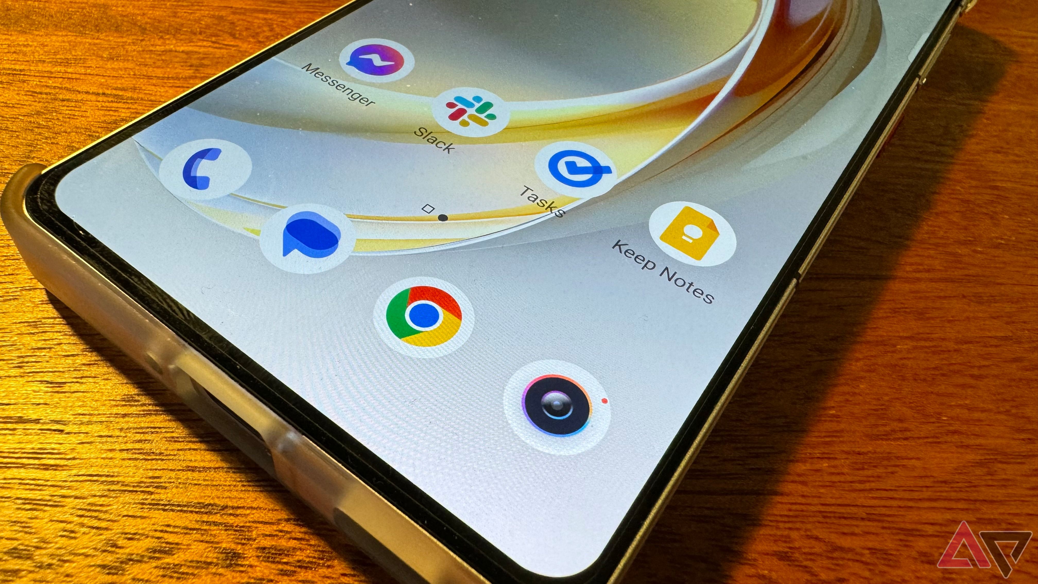
If the app you need isn’t immediately visible in your app gallery, good luck dropping the dragged content. Scrolling and opening apps doesn’t work in that space for some reason. So, there you are, awkwardly holding something with nowhere to keep it, only to be forced to start all over again. Your best bet is to open the destination app on the overview screen or pin it to your home screen.
If you get this far, there’s no guarantee of successful pasting. Your text or image could bounce back. In some apps, like Google Docs, you need to make sure the cursor is actively blinking. Otherwise, the drag shadow vanishes into thin air when you drop it. You’ll have to start over again.
There isn’t even a helpful “Place or drop here” text or an indicator like Apple gives you. When you come to terms with all this clunkiness, you’ll likely give up and never bother with it again. That’s how little you need this feature.
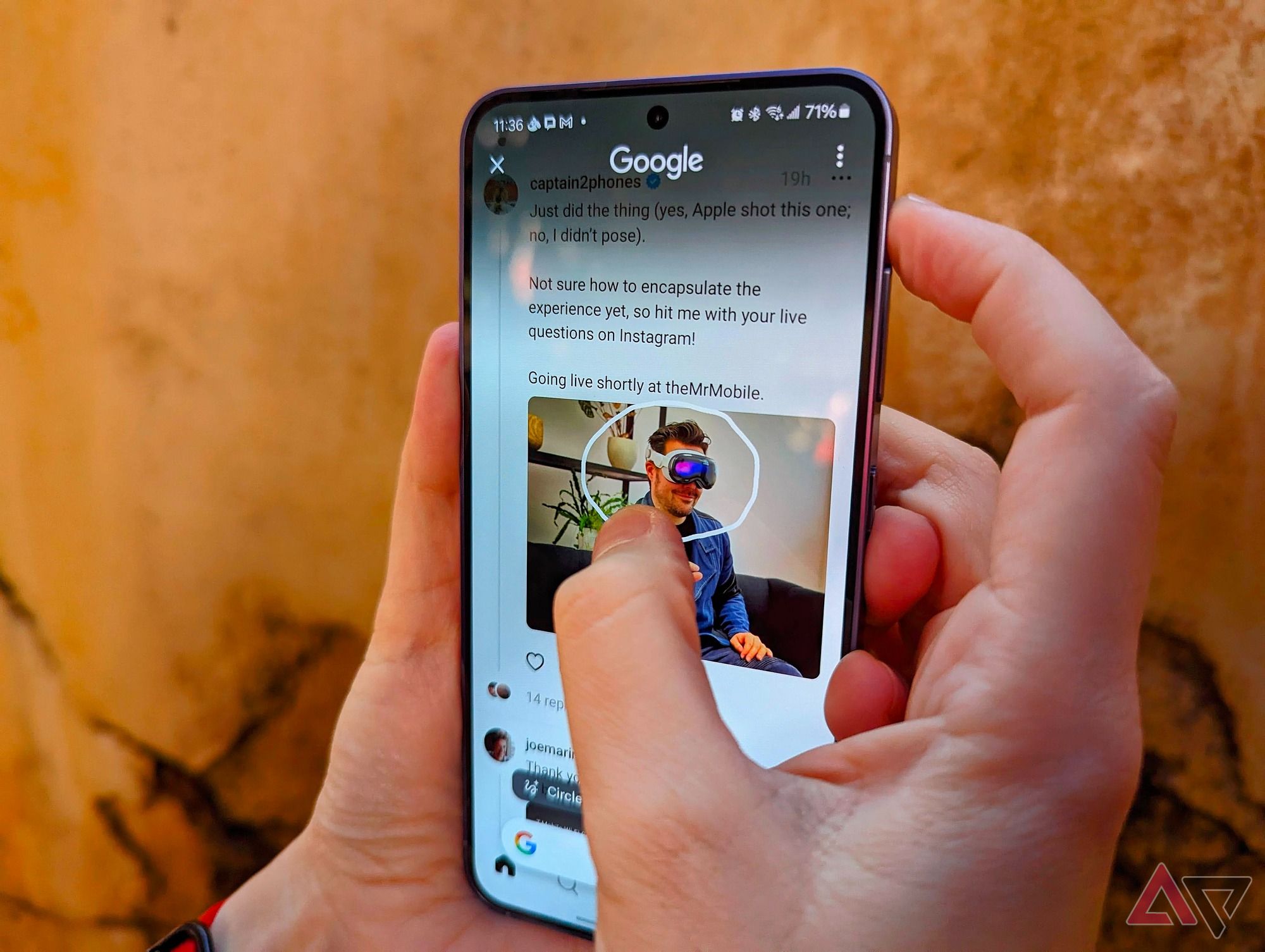
Related
Circle to Search highlights an old problem with Android phones
You can’t use Circle to Search in the notifications shade and we’re crushed
Google should observe Apple
They could learn from iOS
The iPhone’s drag and drop feature needs your hands. Still, it feels more polished than Android. Clear drop zones with a green + sign show exactly where it’s safe to release your item. The motion feels smoother and faster. I can’t say for sure whether it supports extra apps beyond Google’s built-in option.
Still, I haven’t complained as much about using the feature on my iPhone. I moved a fried chicken image from the Photos app into an iMessage chat without worrying about cursor placement or scrolling issues. I also copied text from an AP post on Chrome to WhatsApp.
Drag and drop needs an app tray
Because we need to downsize by one finger
If I could do anything about drag and drop on Android, I’d add sort-of-an-app-tray at the bottom of the screen showcasing the most-used apps. When you drag anything, this tray pops up, similar to how the share options work. There are two ways to implement this. Either you use your other hand to tap the app you want and then drop the content, or you hover the drag shadow over the app to expand it and drop it.
Split screen could use more flexibility
Maybe auto-adjusting will help?
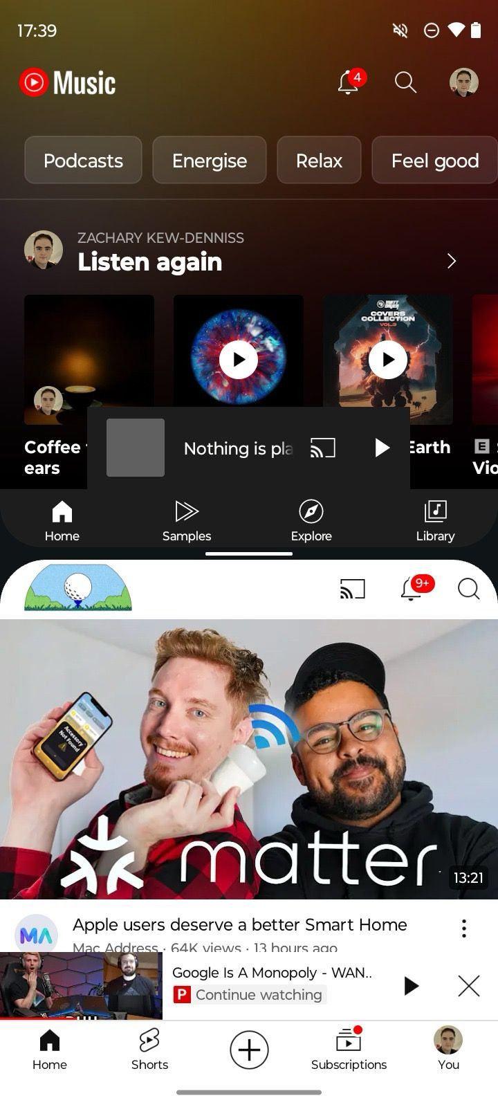
This idea comes from a place of pure pain. Dragging between apps in a split-screen is a breeze on foldables. But not on regular phones. I tried hurling text from Chrome into my Note app, only to have the keyboard in the second screen cover everything up. I couldn’t see where to drop the text. So, I released it, went to the second screen, and minimized the keyboard before trying again. An automatic screen resize would have been nice.
For instance, if you pull a large image or block of text into a messaging app, the window expands so that you can see what you’re doing. When you drop it in, the screen snaps back to the split layout, letting you continue the process.

Make life simpler again, Google
Developers have their work cut out for them. Dragging between apps on mobile is challenging, especially with limited screen space. Phones are designed for vertical use, which is where foldables have the upper hand. While the feature wasn’t designed with accessibility in mind, Google needs to consider that angle when making features and look beyond the tech-savvy crowd. After all, even the tech-savvy can have limited dexterity and accessibility needs or prefer simpler, less fiddly ways to use their phones.
